APOMEDERM BRANDING
VERBAL & VISUAL IDENTITY DEVELOPMENT & PACKAGE DESIGN
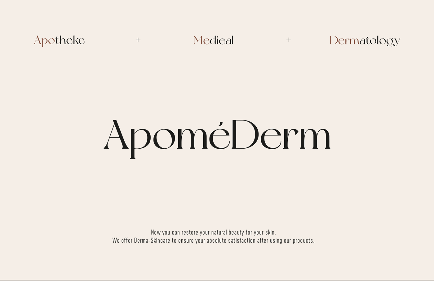
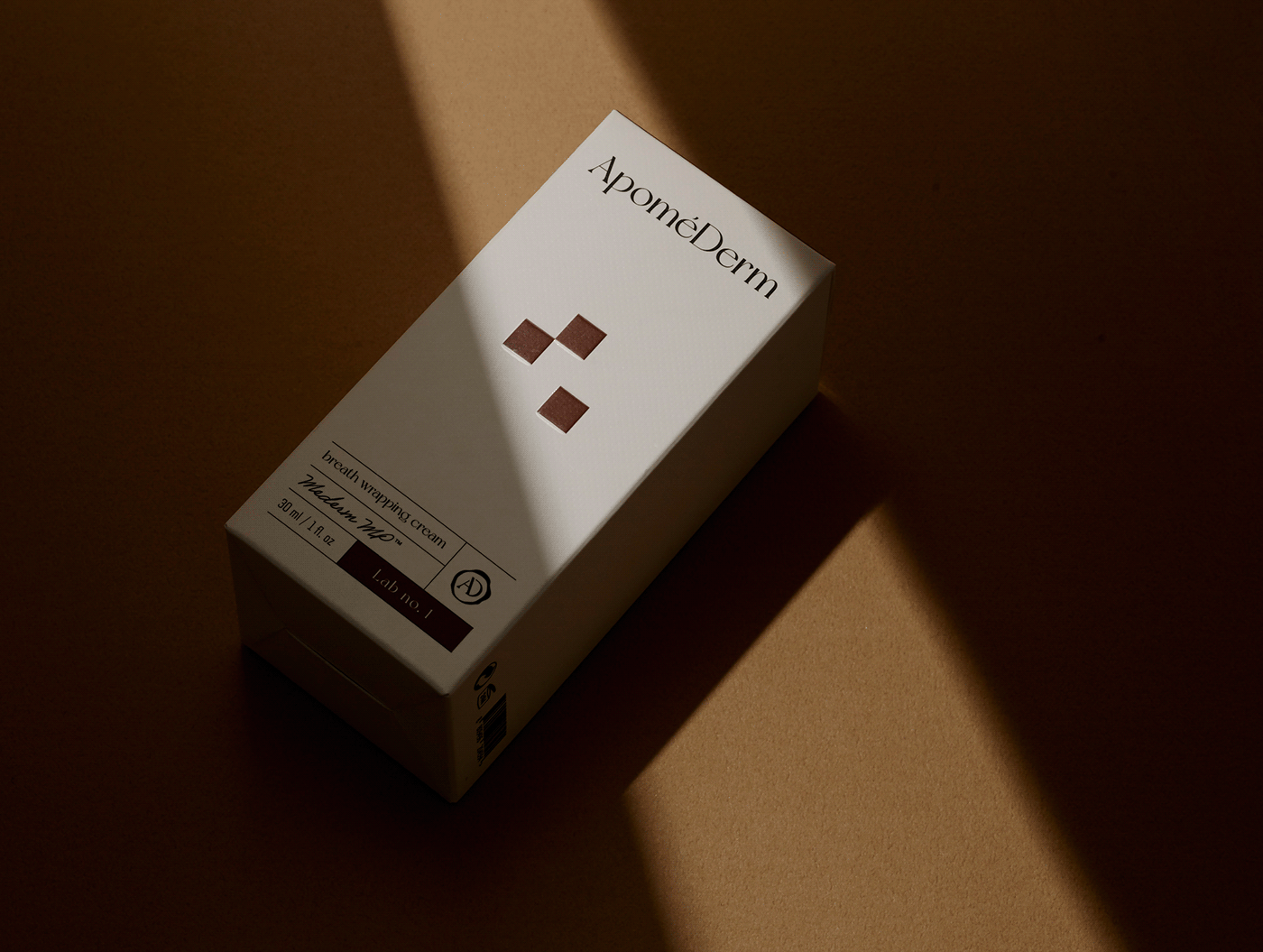
APOMEDERM, a derma brand Inspired by the German pharmacy, ‘Apotheke’.
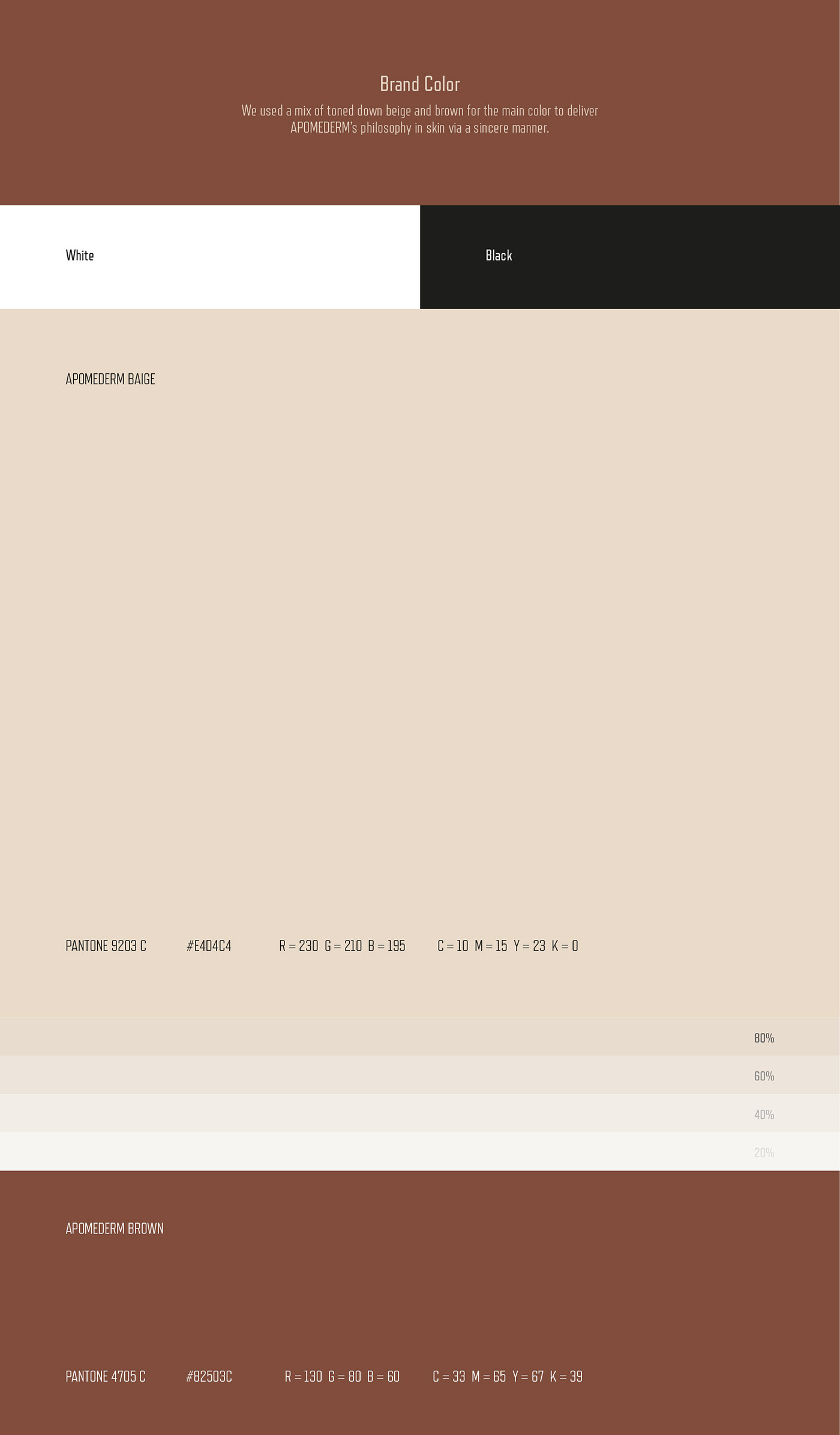
HEAZ was in charge of developing the brand’s identity, symbols, and main colors of APOMEDERM. We proceeded the brand launching project from visual motive to package design.
HEAZ was in charge of developing the brand’s identity, symbols, and main colors of APOMEDERM. We proceeded the brand launching project from visual motive to package design.
We have carefully considered the ways to represent ‘myrhh’, a primary ingredient of traditional German medicinal practices as well as of APOMEDERM. Based on the spatial heritage of pharmacies, we have landed on a concept of a ‘Healing Drawer’. In addition, with mederm MP™, a uniquely licensed ingredient of APOMEDERM, we have presented a skincare solution suitable for modern people’s skin concerns and lifestyles.
Client. APOMEDERM
Year. 2021
Brand Location. South Korea
Contents Director. Seungeun Lee
Copywriter. Hyunseung Yun, Yunhee Cho
Art Diretor. Hyunjung Kim
Designer. Jinsung Yang, Jiyoung Hong
Photographer. Junghun Yeom
Year. 2021
Brand Location. South Korea
Contents Director. Seungeun Lee
Copywriter. Hyunseung Yun, Yunhee Cho
Art Diretor. Hyunjung Kim
Designer. Jinsung Yang, Jiyoung Hong
Photographer. Junghun Yeom